|
|
|
Jan 18, 2013 Feedback from the dry run
Jan 18, 2013 from Riet
Hi Patrick,
I just finished the test, as you can probably see. I am curious if I
passed....
You want my feedback. Here is how I experienced doing the test:
- I felt that I had to do too many actions to keep the process
going. Now I have to look what number I just filled in, find the
next (small) number on top of the page, and click it. The whole
technique feels somehow oldfashioned - not as advanced as it
could be. Also the look of the whole test (lay-out, fonts used
etc)
Suggestion:
- within 2 seconds after showing me the confirmation of my
choice the next slide is coming up.
- or: add a button on the right "NEXT"
- or: you confirm my choice on top (or on the left) of the
page, and give me the next question.
- anyway: no extra mouse-activity required, please see how
survey monkey or google forms do this.
- have the test designed by a professional designer, adding
beauty, class and great style to the test.
- My eyes went down to the answers first, forgetting to read the
question. I think this is, because the answers loaded first.
Suggestion:
- Can you have the question + the picture load first, to
change this experience?
- Also have the question start in the left, and the answers
more towards the center. That will help to see the question
first.
- I found way too many questions dealing with men's rules,
mainly in the appearance section.
Suggestion:
- have a male and a female version of that section. As it is
required to add F or M at registration.
- Some pictures are used more than once. I would not prefer
that. There are so many pictures available, even for free, that
we can use 100% different photos in one test.
Does this provide any support to improve the test further?
Pff, what a job this must be on your side. First creating it and
then dealing with all the comments we have. Thanks for doing it
anyway.
best regards,
Riet
Jan 18, 2013 from Patrick
(Hi everyone, please help with the red
questions.)
Thanks Riet for taking the test and also encouraging key colleagues of
yours in doing the same! First off, it is great to see there were no
network issues in accessing from Europe.
I think you raised a very valid point in that should we eventually provide a version of the exam for men and another
version for women?
There is a recurring request about wanting to see the next question
right after entering an answer. Your suggestion of displaying the
confirmation of an examinee's answer on top of the page along with the
next question below it is a great idea! It solves two issue in one
stroke!
I will work with my guys over the weekend to change this and report
back to everyone...
Thanks again for testing in Europe!
Jan 18, 2013 from Riet
Although there were no problems accessing the test, I had a hard
time finding where to click to go further.
Maybe a button "next" would help in that early stage as well. On
every step a "NEXT" button.
We are getting there!
Riet
Jan 18, 2013 from Patrick
We just had a design meeting; we will try to cut down on the number of
mouse clicks... will report again after weekend.
Jan 22, 2013 from Patrick
Hi Riet and everyone,
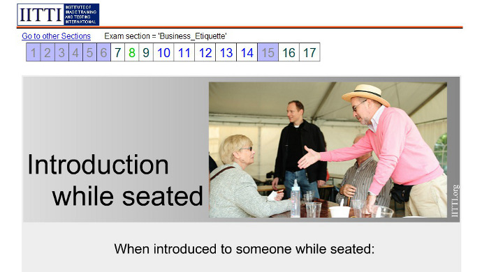
Thank you for all the valuable input and requests. We have implemented
changes that would streamline the exam experience. The recurring
request was to bring users to the next question once the current
question is done. We have (1) done that, and more: we have also (2)
put in a history-indicating colour where already-done questions will
have a blue-gray tone and no longer accessible. (3) The current
question will also get a green highlight treatment as follow:

Riet, the font size in the question number bar has been made bigger.
So it will be easier to click. (Actually users never need to click on
the question bar except the first time because the system will
automatically bring up the next question.)
Yours,
Patrick
Jan 22, 2013 from Deborah
That should make the operation far more user-friendly. Will the bar be visible on the screen?
One of the issues with the previous layout was that you had to scroll up to view the bar.
Thank you for doing such a great job on this.
Jan 25, 2013 from Patrick
With the new bar, the user will not need to scroll up and down to view the bar.
This is because the user will be brought to the next question automatically, and the bar will always be on top in the new page.
|
|


